
Color is often the first thing that people notice about a brand. It has the power to influence consumer perception and emotion. Color can be used to create a unique identity for a brand and to communicate its values and personality. In fact, color is so important that it is often the cornerstone of a brand’s visual identity system.
The impact of color on consumer perception and emotion is well documented. Different colors can have different meanings in different cultures. For example, red is often associated with passion, excitement, and danger in Western cultures, while in some Asian cultures, it is associated with happiness and good luck.
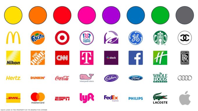
Research has shown that consumers are more likely to remember and recognize a brand if it has a consistent and distinct color palette. In addition, the use of color can affect consumer behavior, such as their willingness to buy, their perception of the product’s quality, and even the amount they are willing to pay. Meaning studies have shown that people perceive a product with a higher price point to be of higher quality if it has a premium color scheme.
The psychology of color in branding is a complex and multifaceted topic. Color can be used to convey different brand values and personality traits, such as sophistication, playfulness, and reliability. In addition, the context in which a color is used can also affect its meaning and impact. For example, the same shade of blue can be used to convey both professionalism and relaxation, depending on the context.
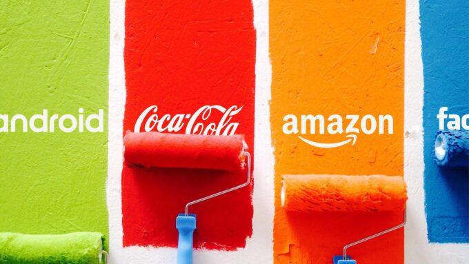
Colorful Campaigns
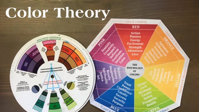
Colors can communicate different meanings and associations. Understanding the meaning of colors can be a guide when it comes to branding, marketing, and design. Here is a brief overview of the meanings of some common colors:
Red is a bold and attention-grabbing color that can convey energy, excitement, and urgency. It is often associated with passion, love, and danger. In branding, red is commonly used to create a sense of urgency or to convey a sense of excitement and energy. Food brands also use red to stimulate appetite.
Orange is a warm and inviting color that can convey friendliness, creativity, and warmth. It is often associated with fun, playfulness, and enthusiasm. Brands that use orange in their branding often want to convey a sense of approachability, friendliness, and creativity.
Yellow is a bright and cheerful color that can convey happiness, optimism, and clarity. It is often associated with sunshine, joy, and positivity. In branding, yellow is often used to grab attention and convey a sense of playfulness.
Green is a calming and soothing color that can convey growth, health, and tranquility. It is often associated with nature, freshness, and environmentalism. Brands that use green in their branding often want to convey a sense of health, wellness, and environmental responsibility.
Blue is a calm and trustworthy color that can convey trust, reliability, and calmness. It is often associated with stability, professionalism, and security. Brands that use blue in their branding often want to convey a sense of trustworthiness, reliability, and professionalism.
Purple is a rich and luxurious color that can convey creativity, mystery, and royalty. It is often associated with spirituality, magic, and creativity. Brands that use purple in their branding often want to convey a sense of luxury, creativity, and sophistication.
Black is a sophisticated and elegant color that can convey power, elegance, and exclusivity. It is often associated with luxury, sophistication, and authority. Brands that use black in their branding often want to convey a sense of power, elegance, and exclusivity.
White is a pure and simple color that can convey purity, innocence, and simplicity. It is often associated with cleanliness, minimalism, and purity. Brands that use white in their branding often want to convey a sense of simplicity, purity, and elegance.
Color Theory in Action
The role of color in branding is crucial, as it plays a significant part in creating brand recognition and differentiation from competitors. Establishing a distinct and recognizable color palette is essential to creating a successful brand identity. A well-designed color palette will align with the brand’s values and messaging and evoke the desired emotions in the target audience.
Selecting a dominant color is an essential aspect of creating a memorable brand. This color serves as the primary identifier for the brand and should be incorporated across all brand touchpoints. The dominant color can help consumers recognize and differentiate the brand from competitors, and it can also create a sense of familiarity and trust.
Color can also be used to differentiate from competitors and create a unique brand identity. Incorporating color in branding is especially important in the packaging industry, where brands often compete for attention on store shelves. The color palette and design of the paper bags or boxes can influence consumers’ purchasing decisions and make a significant impact on a brand’s success. By using color strategically and consistently across their packaging, brands can create a unique and recognizable visual identity that stands out and attracts consumers’ attention.
Incorporating color consistently across all brand touchpoints is essential to creating a cohesive and recognizable brand identity. This includes using the same colors on packaging, advertising, and digital platforms. By doing so, the brand can create a consistent experience for consumers and reinforce their brand identity and messaging.
Painting a Picture

Choosing colors for branding based on the intended emotional response from consumers can be a powerful tool to communicate a brand’s messaging and values. Different colors can evoke specific emotions and have unique psychological associations. For example, green can communicate growth, health, and tranquility, while red can convey energy, excitement, and urgency. By understanding the emotional responses that different colors can evoke, brands can select colors that align with their intended messaging and target audience.
The impact of color on consumer perception of product quality and value is another critical consideration when selecting colors for branding. Consumers often associate specific colors with particular products and industries, and certain colors can communicate a sense of luxury or quality. For example, a brand that sells high-end jewelry may use black and gold to convey sophistication and elegance, while a brand that sells affordable household products may use bright and cheerful colors to communicate value and affordability.
Balancing color trends with the longevity of brand identity is essential to creating a successful and lasting brand. While it can be tempting to follow current color trends, it’s important to consider the long-term impact of selecting trendy colors for branding. Trends come and go, and a brand that follows every trend may quickly become dated and lose its identity. By choosing a color palette that aligns with the brand’s values and messaging rather than just following the latest trends, brands can create a timeless and enduring visual identity.
Color in Context

Applying color psychology in branding can be a challenging task, as several factors must be considered to ensure the colors used to resonate with the target audience and effectively communicate the brand’s messaging. One of the primary challenges is ensuring that the colors used are culturally appropriate and align with the values of the target audience. Thus, careful consideration must be given to the cultural background of the target audience when selecting colors for branding.
Another challenge is adapting color choices for different products and services. What might be effective for one product—a colorful color scheme for a kid’s toy—would not be effective for another—say, a sleek, sophisticated color scheme for high-end gift boxes. Thus, brands must adapt their color choices to each product or service they offer to ensure that they align with the intended messaging and target audience.
Keeping up with changing consumer preferences and trends is another challenge in applying color psychology in branding. Consumer preferences can change rapidly, and what may be popular today may become outdated tomorrow. Brands must stay current with color trends and consumer preferences to ensure that their branding remains relevant and resonates with their target audience.
Despite the challenges of applying color psychology in branding, there is a positive note to this effort. By being more intentional in marketing efforts, brands can create a more significant impact on their target audience. Color psychology can be used strategically to evoke emotions, communicate messages, and create brand recognition. Brands that take the time to carefully consider the colors they use and adapt them to different products and services can create a strong and enduring visual identity that resonates with their target audience. Ultimately, this effort can lead to increased brand recognition, loyalty, and sales.


