
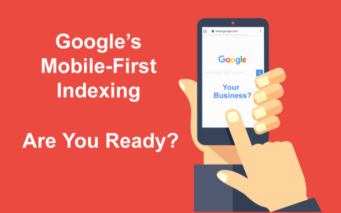
Today’s article will be about things you should know about mobile-first indexing, but before elaborating on that, let’s clarify what Google indexing is Google search index is the catalog of websites that Google has access to and “crawlable” websites that have value for users. Google ranks those sites by criterium of how relevant and user-friendly the website is for a certain search. At present, Google is giving primacy to mobile-first indexing because of mobile search popularization. Alpha Efficiency will dedicate this post to approaching readers on the issue of mobile-first indexing and eight steps to consider when building this conscientiously strategic investment.
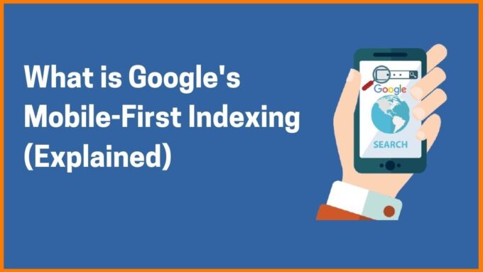
Defining Mobile-First index
Mobile-first indexing is fundamentally the Google process of indexing and ranking a website based on mobile compared to desktop performances of the website.
Today, as the majority of the searches happen through mobile devices, this index primarily relies on the usage of mobile sites when rating the significance of web pages on users’ queries. This mobile-first algorithm updates quickly nowadays, as more than 60% of internet searches occur on mobiles and increase. Google has prioritized the ranking based on the best-performing websites on mobile devices. As people numerously use mobiles for internet surfing, it makes all sense that Google will index and rate content by mobile site version and shift to mobile-first indexing. In 2016. Google first announced moving to mobile-first indexing. By that year, Google gradually rolled out more and more websites, and in march 2024.

Google declares to roll out mobile-first indexing on every site. Consequenciously, the index has become mobile-only. This implies that your website is already moved to a mobile-first basis and if not, it will be very soon. Previous deadline to switching to mobile. The first indexing was March 2024., but reportedly Google has dismissed this deadline and the moving is not done yet. To check if your website is in mobile-first indexing use the Google Search Console-Settings-About section. If your site is still in a desktop-based index it would be wise to prepare your website for these changes. Googlebot principally crawls and indexes pages with the smartphone’s agent. Google mobile indexing will use only mobile versions of the site to ranking, which means that if your website doesn’t have an optimized mobile version or your business doesn’t have a mobile version at all, this will affect decreasing of organic traffic on your desktop site and SEO. Assure your website is optimized for this algorithm and has a strong smartphone present, these are the steps you should consider:
1. Instead of developing a mobile site version from a traditional desktop, the option is to make a website for smartphones that will have the ability to serve on multiple platforms. Make a responsive design that will function on every device without the mandatory to create a different version of the website for various devices. Ensure the identical look of the website on every gadget.
2. Make sure your website is not overloaded with interstitials and overcrowded with content. Simple design is a convenient solution for mobile versions. Order the page elements according to your work relevance. Highlight your company’s priorities and offerings. Part of the desktop content should be excluded due to the screen of mobile vs. desktop size. Limit the additional elements on the page like exceeding pop-ups, and hide the unnecessary content while offering the options such as “expand” or “read more” to reduce displayed content without removing it. Removing the content will affect the SEO so the proposed solution seems more convenient.

3. Check the appearance of text, images, and visual content on the mobile version. The great part of the mobile site user experience is the quality of visual elements. Provide the images that contain details with a clear message. Use appropriate image formats. Google has notified that their system doesn’t support image format jpg in tag inside inline SVG. The same is with the video formats. The added video formats on the desktop site should function in the mobile version. A crucial problem to avoid is to ensure that your URL remains unchanged when pages load your video. Text content in mobile versions requires better space usage. The text should be short, concise, and specific while attractive to reach readers. Choose relevant, valuable, and effective information for engaging visitors.
4. Page speed. Page speed is crucial in SEO ranking on desktop sites but in mobile versions seems even more. Optimize your mobile design by minifying code, limiting redirections, compressing images, and caching web pages.
5. Consider the Googlebot access. Include these tips so Google can read your content and send traffic:
-
- Use identical meta robot tags for both desktop and mobile website versions. Check for “unfollow” and “noindex” tags avoiding of being blocked from crawling
- Load content that requires interaction with users
- Check that you are not blocking any pages from being crawled in your robots.txt file

6. Ensure your desktop and mobile site have the same structured data y using the current URL. This also applies to metadata and should be exact on both website versions.
7. Implementing Mobile-first features. The Voice search option is the tool primarily available for websites on mobile devices. Features such as one-click payment, purchasing via social media platforms, and applications are also primary mobile version equipment that meets modern customers’ habits.
8. Mobile-first index and customer data. The mobile-basis websites can expand their customer database, by adjustments and modifications suitable for mobile devices. Location tools or social media intertwined help in gathering information about users’ behavior, preferences, affinities, and expectations. While emails, phone numbers, and purchasing history, can be used in creating and sending personalized offers.
Final Thoughts
Mobile-adapted website is not only a trend and a way to keep up with the industry innovations but a necessity. The ability to adopt changes and embrace progress is our advantage over competitors and an opportunity for success. Mobile-first index is the ultimate adjustment to make a mobile version priority. The mobile version must not be just part of the desktop version for business. Google no longer considers the desktop site for ranking so neglecting the mobile site will eques a lower ranking and a decrease in conversion. Although, the desktop fall at the secondary level, the user experience there is still important. Nonetheless, customers increase the time spend on their mobile devices rather than on desktop sites, and meeting their needs and tailoring the experience on mobile devices become a precedence.


