
For the Average Joe, the world economy is a tricky beast to get your head around.
Visuals can sometimes be a whole lot easier to digest than all of the whitepapers that are circulating – and this is what we have been done today.
Here are a collection of infographics that explain the world economy, and perhaps make things a little clearer.
The $80 trillion world economy 
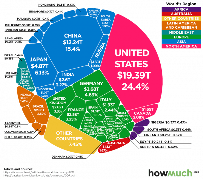
Granted, this infographic is just over a year old, but due to the sheer scale of the numbers flying around this shouldn’t matter too much.
The reason we have chosen it is because of the perfect way it displays the $80 trillion world economy.
It shows, in no uncertain terms, just who are the big players with a clear percentage issued next to them. For example, in terms of the United States, not only does this contribute $19.39 trillion to the world economy – but this is a ridiculous 24.4% of it!
How the gig economy is impacting the normal economy 
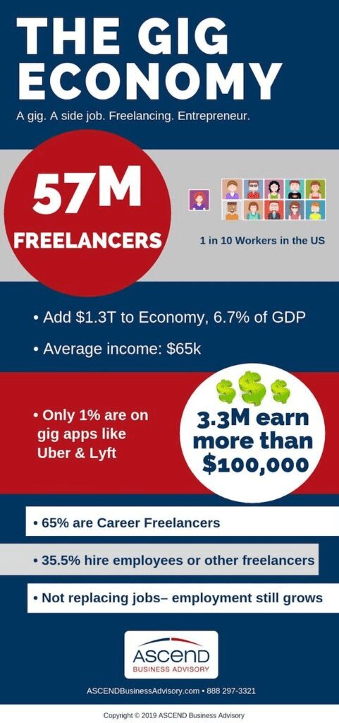
Some people are quick to dismiss the gig economy, but this next infographic should hopefully highlight just how crucial it is to the economy as a whole.
The graphic is utterly simple in nature, but it does a fantastic job of outlining the main points about the economy.
For example, it shows that 1 in 10 workers in the country are in this gig economy. This equates to a monumental 57m freelancers.
These tens of millions of freelancers add $1.3t to the economy and contribute a mammoth 6.7% of GDP. Wow.
The world’s biggest exporters 
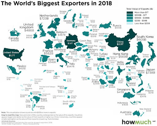
This is a study that Howmuch.net run on an annual basis, so the 2019 version should be available very soon.
For now, 2018 paints an interesting picture. The map shows the sheer dominance of some countries when it comes to exporting – particularly the United States, Germany and China. Most other countries don’t get a look-in – these are the big three players by far.
What are the most traded goods in the world? 
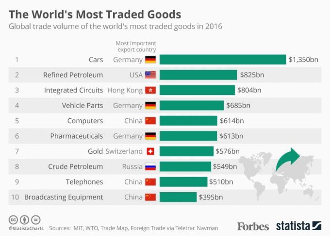
Following on from the previous infographic, this next one looks at the items which are fueling all of these exports.
Perhaps unsurprisingly, cars top the charts, and in some ways dominate them as “vehicle parts” is ranked as fourth on the list.
How Brexit could affect exports 
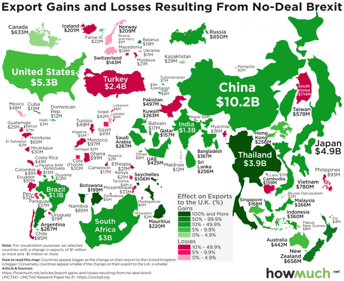
Staying on the topic of exports, this next infographic is another interesting viewpoint. This time, it looks at just how some countries are going to be affected by a no-deal Brexit if it happens, as this political upheaval will impact the way in which some nations trade.
It perhaps highlights one issue that a lot of people struggle to understand; no money is being “lost” as such, it’s just moving around the world differently.
The state of foreign aid 
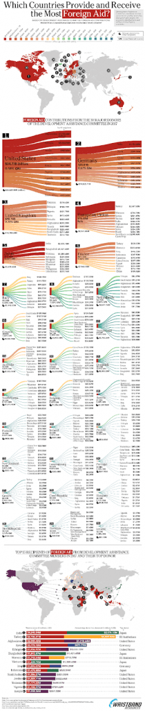
Source: https://www.wristband.com/content/which-countries-provide-receive-most-foreign-aid/
It can be a polemic topic, but in terms of the world’s economy few would disagree that this is hugely important.
This infographic sums it to a tee. It covers all bases, whether it’s the biggest donors of foreign policy, or those nations which receive the most.
In some ways, there are few surprises. However, if you look closely and especially look at the proportion of national income that some countries are spending on foreign policy, it’s then when questions might start to mull around in your head.
Africa: A continent which is truly developing 
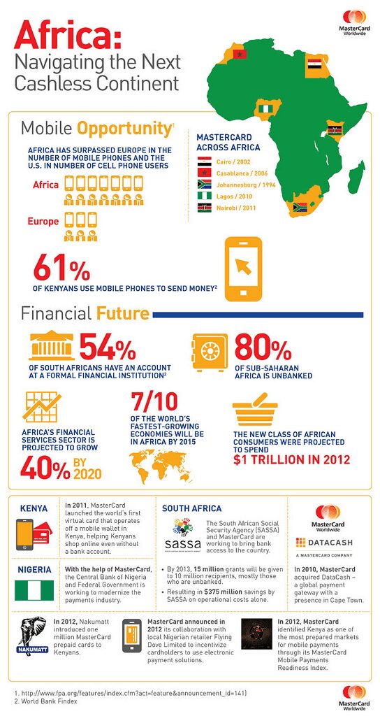
We’ve just touched upon the topic of foreign aid, and this is something that tends to attract mentions of Africa.
Well, while they might benefit from foreign aid in some areas, this next infographic shows how their economy is developing faster than anyone could have imagined. For example, if we turn to Kenya, 61% of this country send money via a mobile phone. Such a statistic would have been absolutely unheard of not too long ago.
To settle a few nerves, we should clarify that Mastercard are the company who have pieced together this infographic – so all of the information should be completely above board.
An annual review of the world economy 
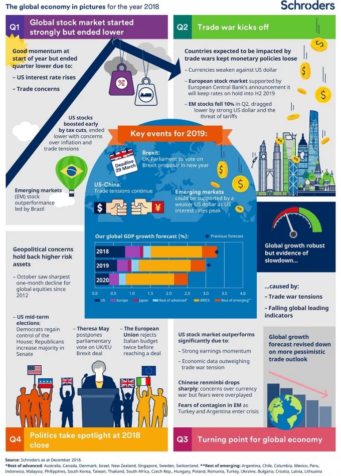
Again, this is one of those infographics that might be replaced by a more updated version shortly, as it was initially conducted at the end of 2018.
Many things remain the same though, and it’s quite interesting to see some of the predictions that Schroders initially made and whether or not they have come to fruition.
Unfortunately, in relation to the US-China relationship and Brexit, nothing has really changed
Worldwide predictions for 2024 
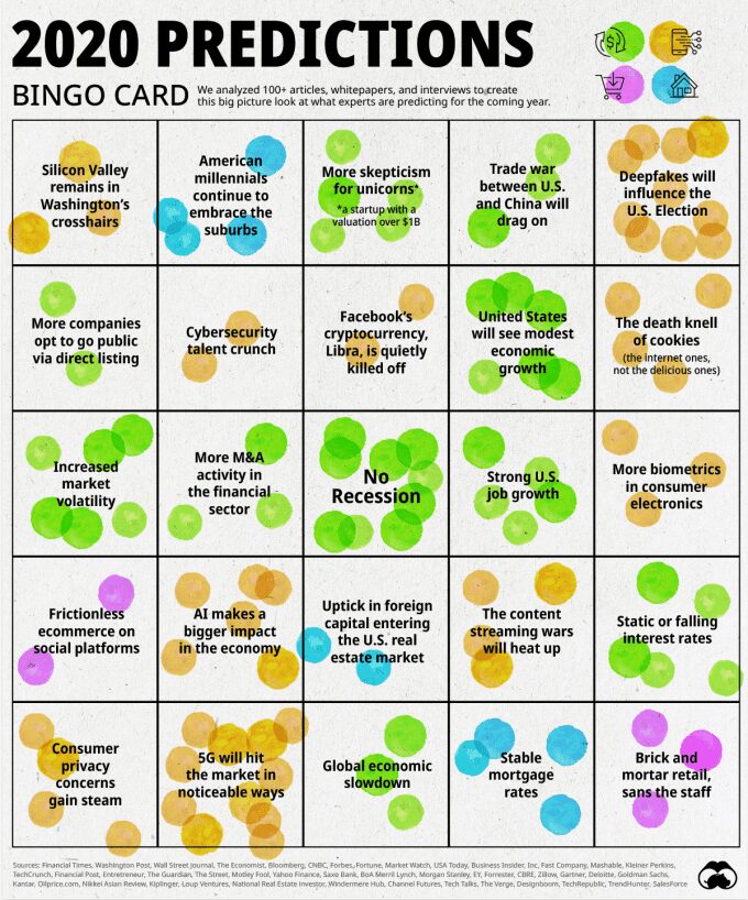
This next infographic is all about predictions. Of course, it’s not any old predictions, it is predictions from some of the most established experts in the world.
The team at Visual Capitalist have already been featured here today, and it’s time for another mention. They have shrewdly scanned over 100 articles, whitepapers and interviews and plucked out all of the main predictions that people tend to be tipping for 2024.
There are plenty that will raise eyebrows as well, depending on which side of the fence you sit on. For example, ‘No Recession’ is one powerful prediction, while another is that there will be continued job growth in the country.
We’re not usually big on these sorts of opinion-based infographics, but due to the way they have collated so many views, this is one infographic that really sparked our interest.
The American public is looking for a much more financially secure 2024 

Finally, let’s talk about new year’s resolutions.
Ipsos initially pulled this data together, but Statista have gone one step further and visualized the study into an easy-to-digest bar chart.
To be honest, we’re not really concerned about some of the resolutions – they don’t touch the economy in the slightest. The big headline for us comes with the fact that the most popular resolution for Americans was to Manage finances better.
Considering how eating healthier and losing weight usually dominate these resolutions – we’d say this is quite a step forward.


